SOLE.
🖥️ eCommerce Website Concept
📋 TL;DR
Created “SOLE,” a concept comparison website for trainers, inspired by brand loyalty challenges in online shopping. The project blended UX patterns from price comparison platforms with leading Trainer brand sites to deliver a unified, intuitive shopping experience.
📝 Background
Not long after I moved back from Bournemouth, the global pandemic sent the world into lockdown and my career would soon be put on hold. All of my scheduled interviews were cancelled, companies were understandably hesitant on hiring new starters, and at this time in my life, I was ultimately lost on what to do next. However, I didn't want to sit around and do nothing with my time. I began to work on side projects to keep my skills sharp whilst having fun at the same time.
One day, I stumbled across this awesome website known as Briefz.Biz. This website is a design brief generator supported and backed by an awesome community. With this website, you are able to generate random: Branding Design, Graphic Design, UI/UX Design, and Web Design briefs.
There are no limitations, no guidelines, no help decks, and no deadlines. These parameters are set by yourself. It puts the accountability on you to complete each brief (whilst letting your creativity run wild at the same time). The thing I love about this resource is that it allows you to put together a 'mock' project scope to emulate what it would be like in a live environment.
💡 Ideation
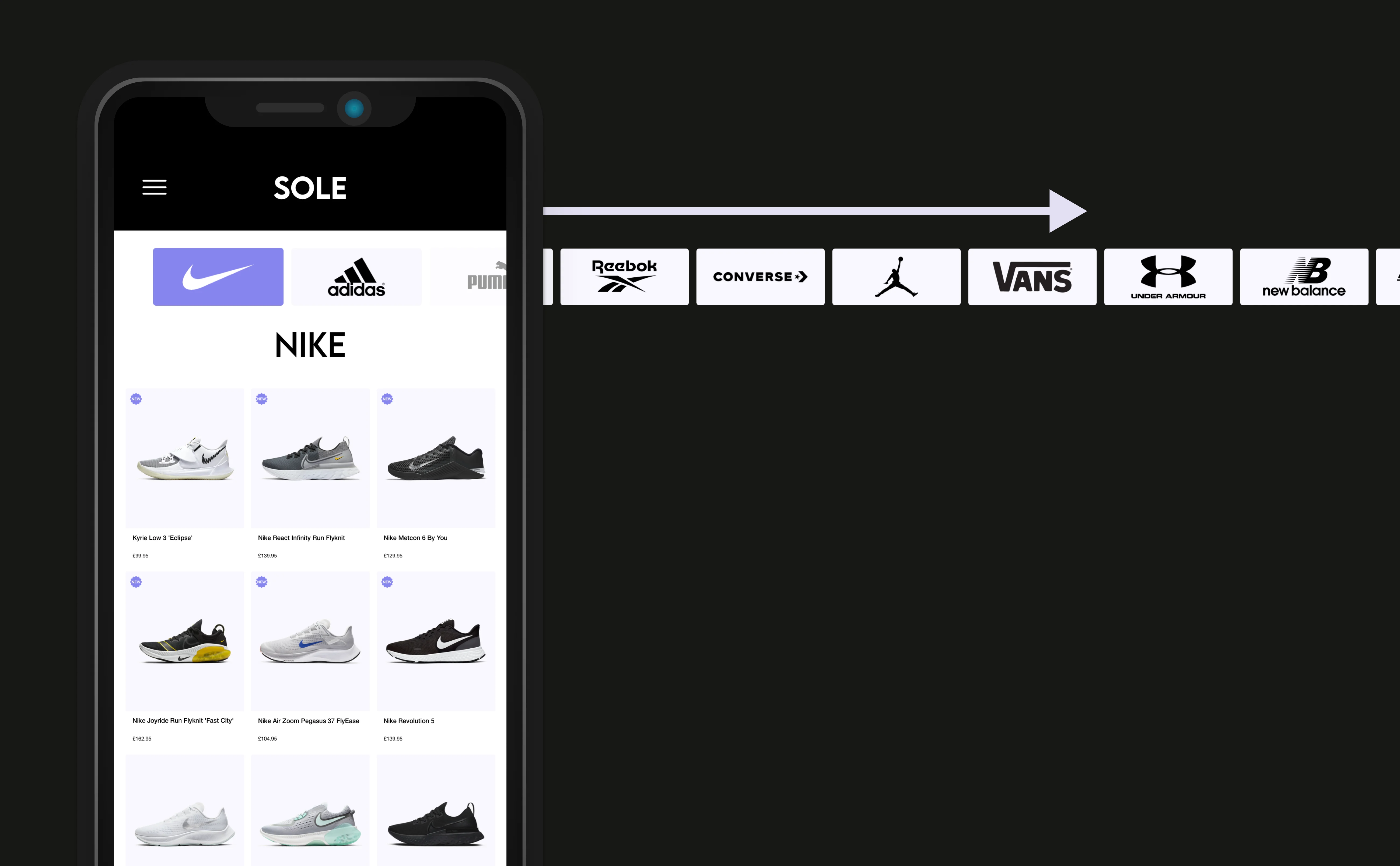
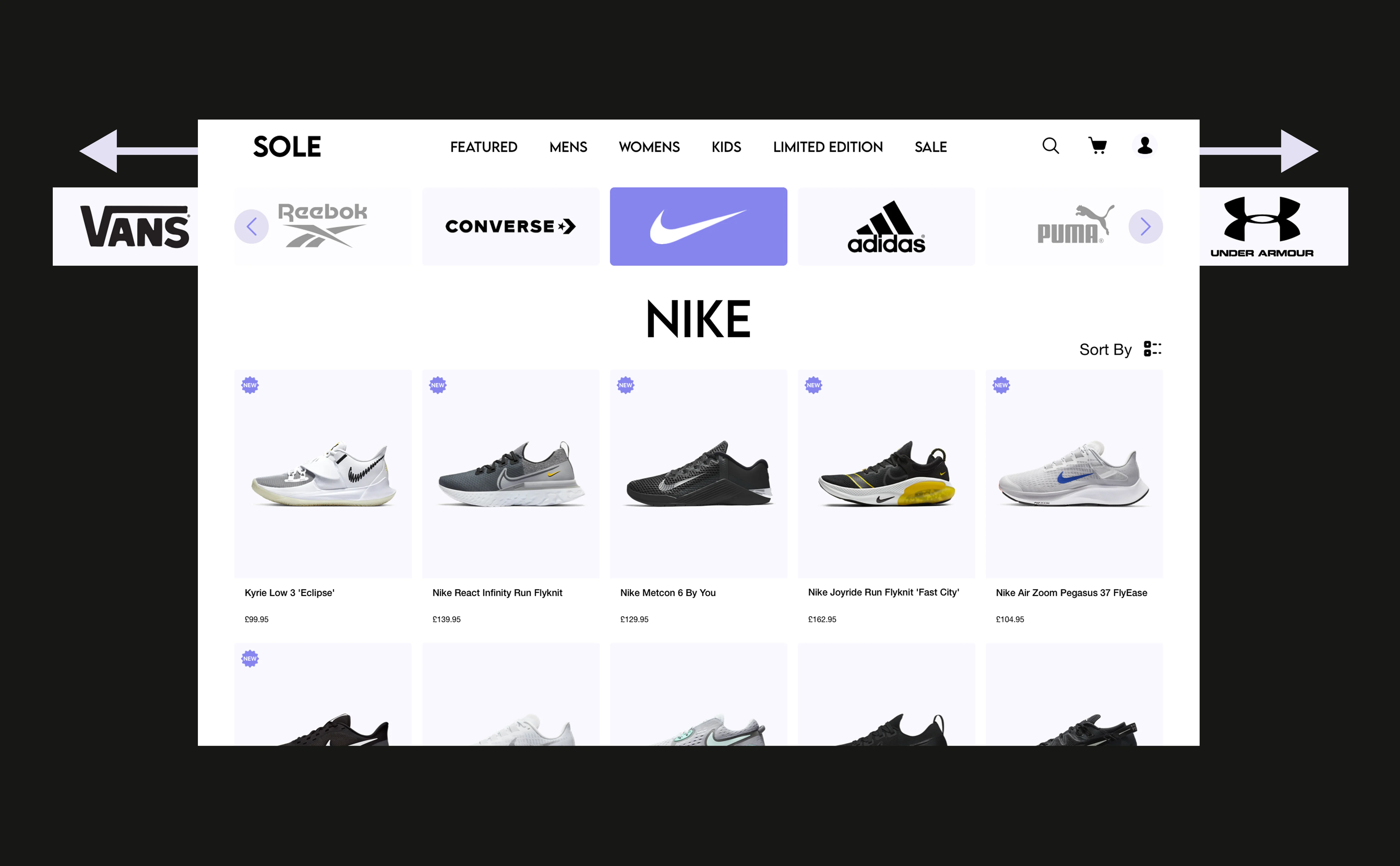
The website that I chose to design is called SOLE. Why did I choose to create a website around trainers? When it comes to online shopping for trainers, I have my go to websites but those are very much brand specific. Some would say its brand loyalty, others would say its better to buy from somewhere you've purchased from before. But if we're honest with one another, its not an easy decision when it comes to picking a pair of trainers (or any pair of shoes in that matter).
This is what sparked the idea to design a comparison-esque website where you can compare different trainers from different brands all in one place.
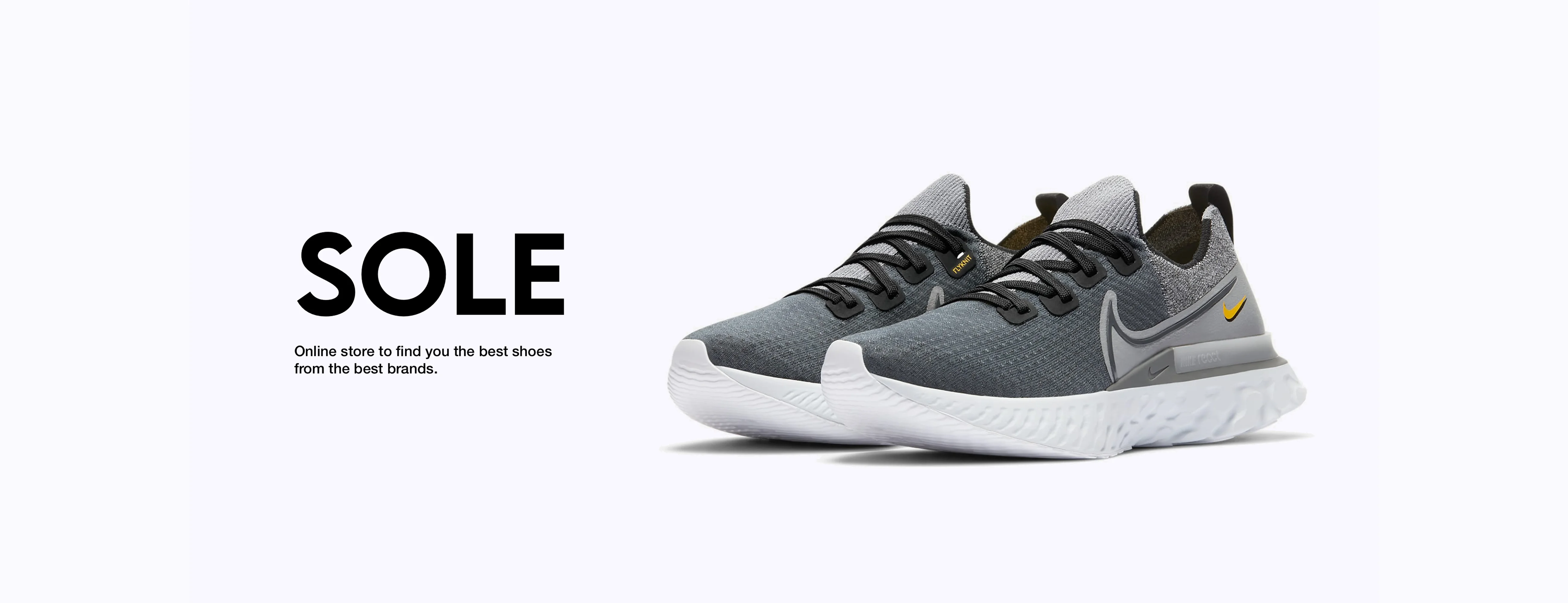
So lets take a look at the chosen name, SOLE.
If you look at the meaning of the word SOLE, it means "the bottom part of the foot that touches the ground when you stand or walk, or the bottom part of the shoe that touches the ground". So you have the soles of your feet, and the soles on your trainers.. and wherever you go, you need a pair of shoes on. So to me, it made perfect sense to call the website.. SOLE!
As previously mentioned, I wanted to not just create a website that lists trainers from any and all brands. I wanted to create something that felt familiar to users, but it had its own look and feel that felt intuitive to use.
I looked at multiple comparison websites to see what common themes could be noticed across each of them, but also see if there was something missing or overlooked. The comparison websites I looked at for inspiration were:
- Compare the Market
- GO Compare
- MoneySuperMarket
- Money Saving Expert
With the above resources, I also looked at the leading trainer/shoe brands to see if the idea I had in mind would work with these types of websites. The brands I looked at was:
- Nike
- Adidas
- Puma
- New Balance
With these two different areas providing valuable insights, I was able to go through the process of mapping out the project, sketch-out wireframes and design high fidelity mockups.
🎨 Branding
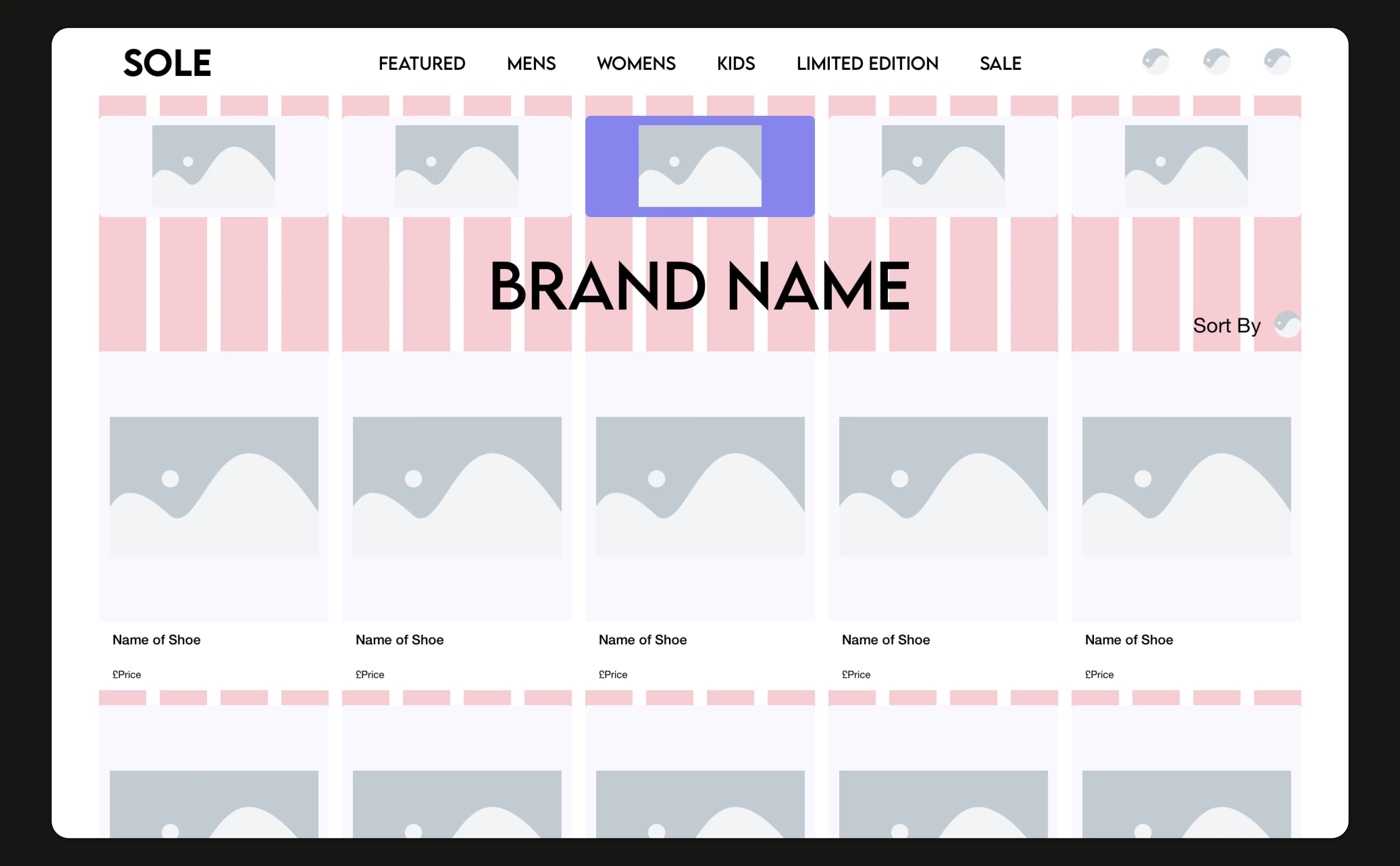
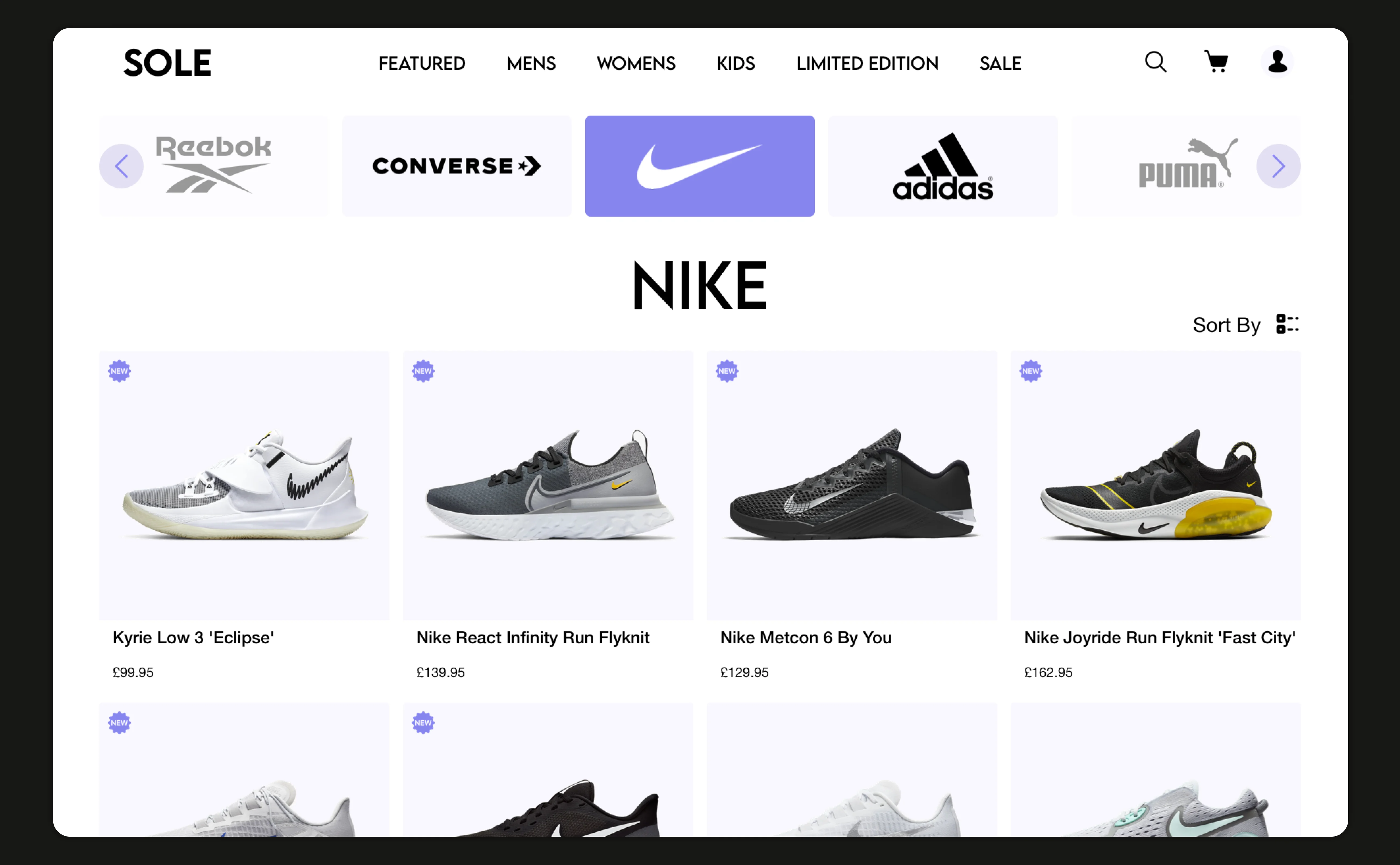
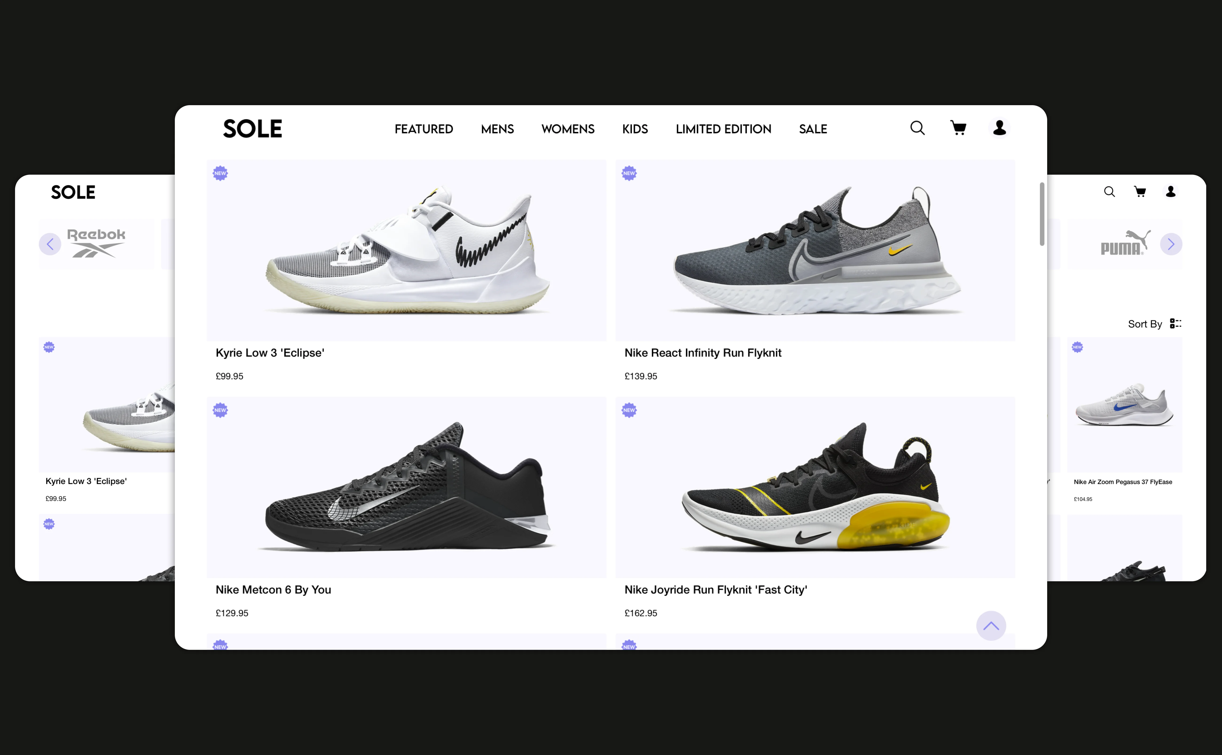
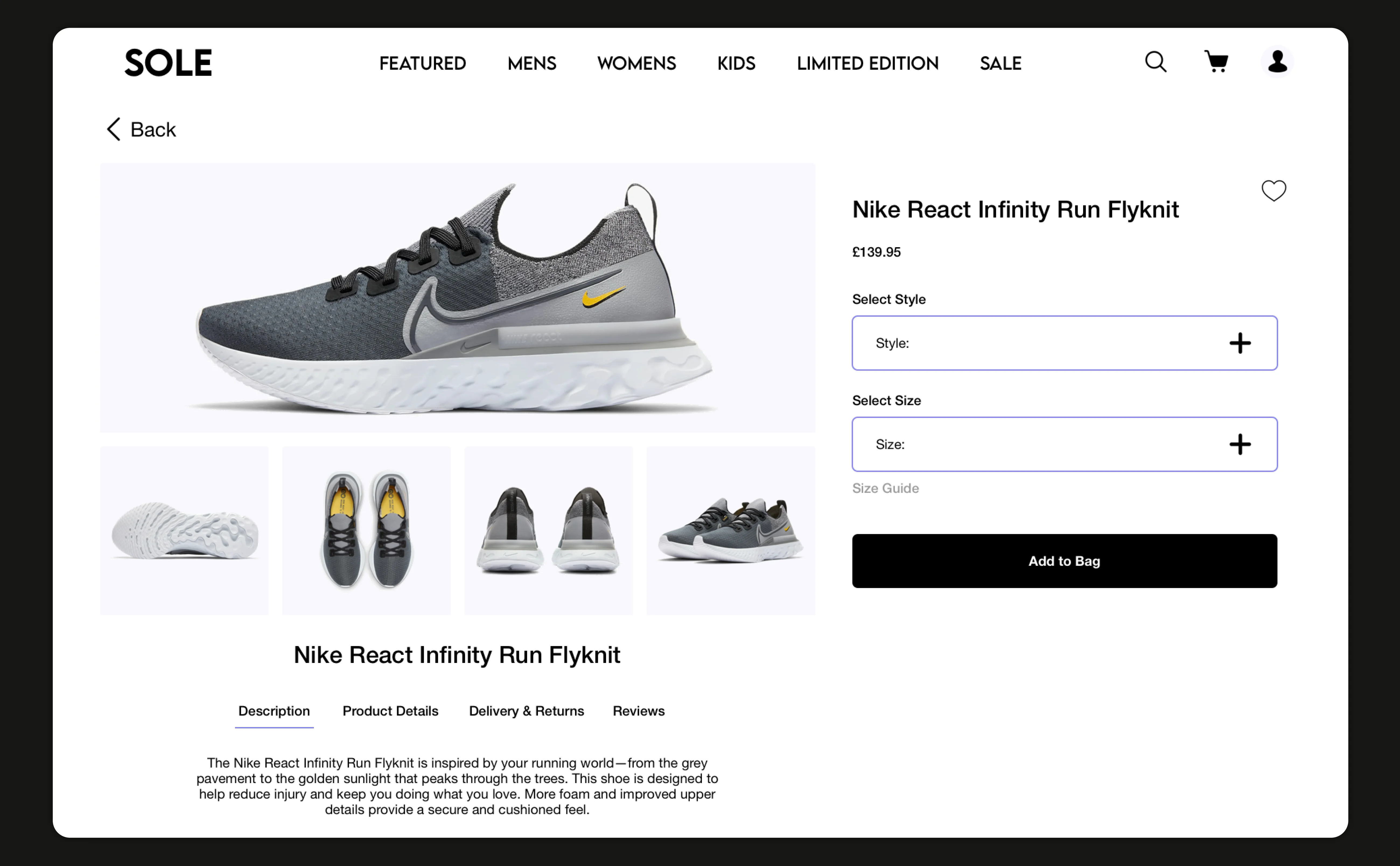
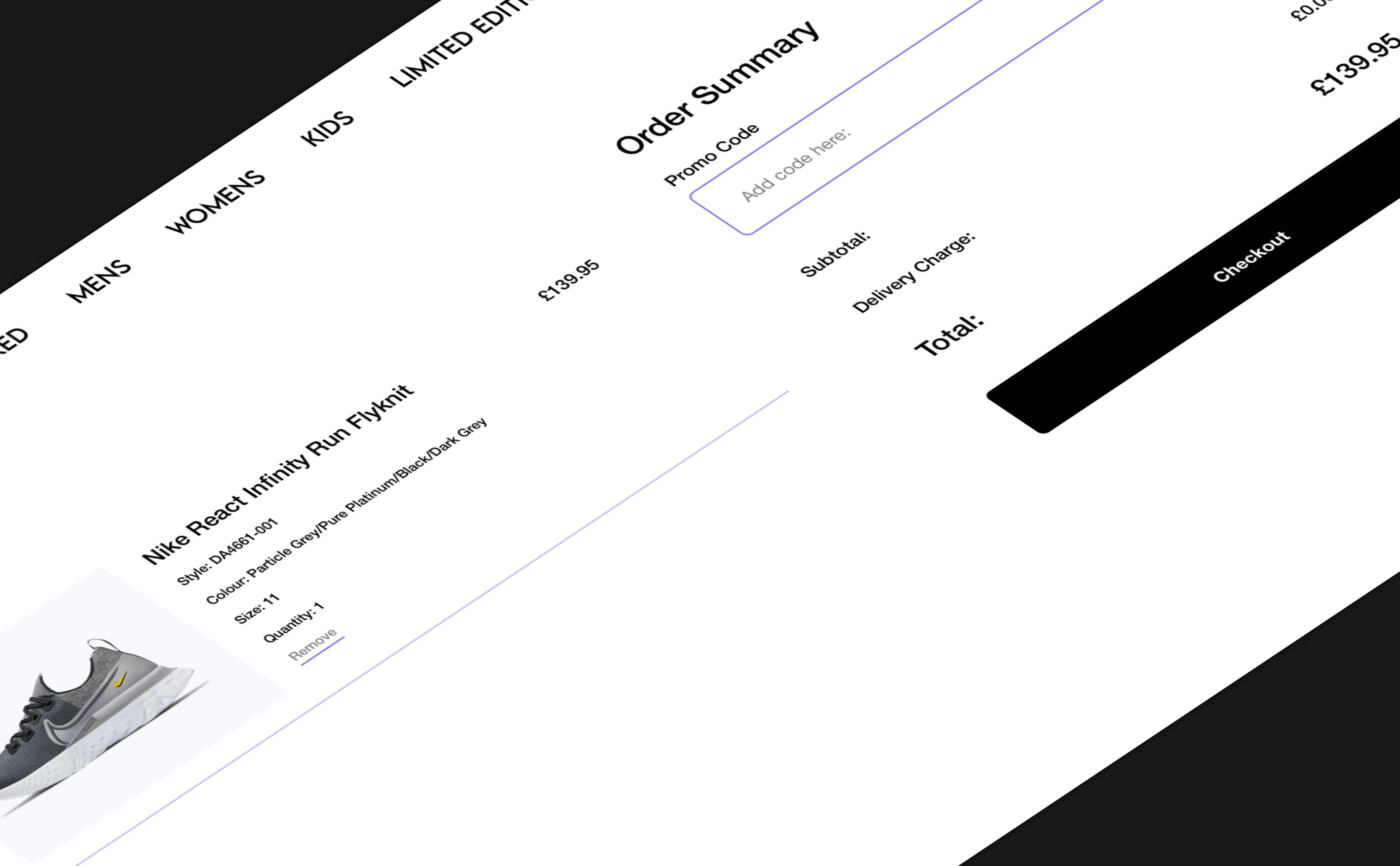
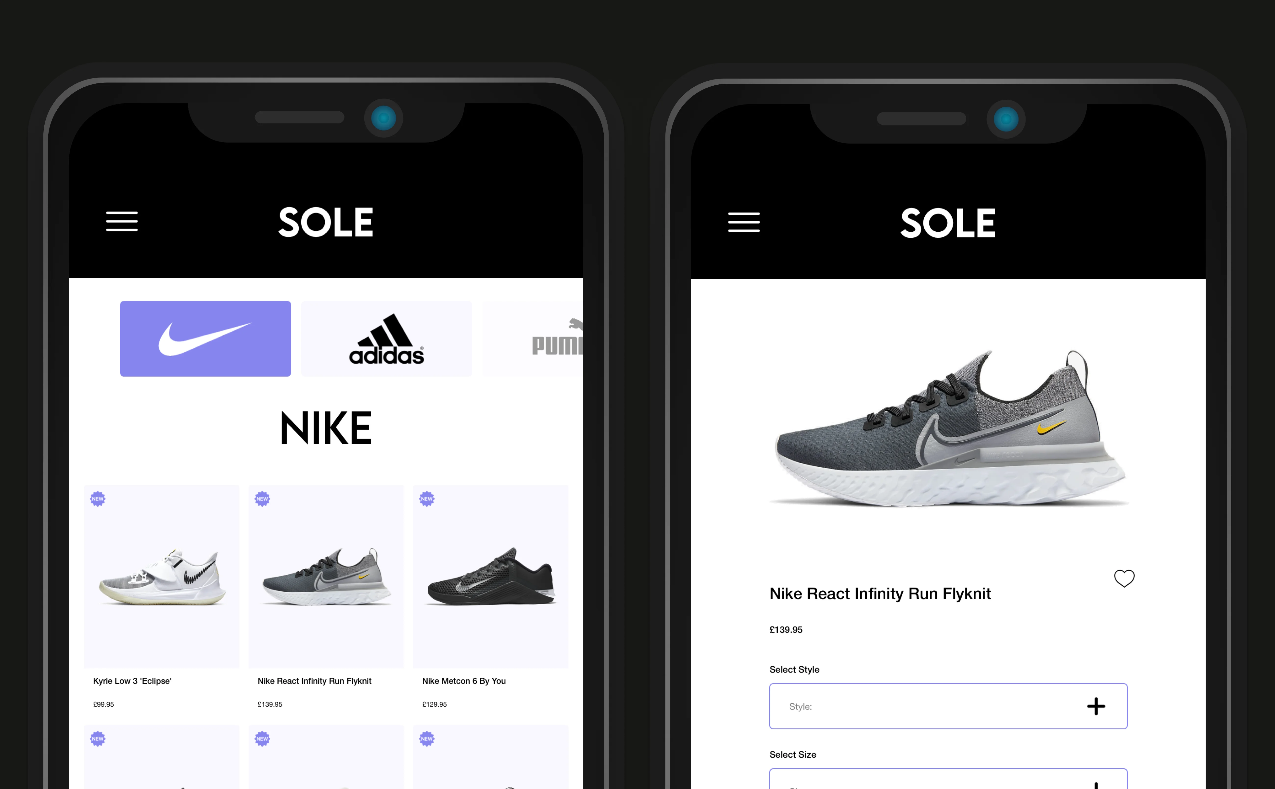
🖼️ Final Designs
These are the final designs created for the project brief