The Pokémon Company website redesign
TL;DR
A thoughtful redesign of the official Pokémon website that balances the visual refresh with an improved user experience. This project modernises the websites look and feel—introducing a cleaner, more dynamic interface—while refining layout, navigation, and responsiveness to enhance usability across devices. The redesign stays true to the original content and structure, whilst remixing familiar elements into a more engaging and accessible experience.
Challenge & Approach
So.. whats the problem? In my eyes, the official Pokémon website just... works.
After taking some time to explore the Pokémon website in more detail, it was immediately obvious that the main purpose of website is to serve as a 'news' platform which aims to deliver the latest information from all areas of the Pokémon world. If you look at the website from this viewpoint, you can see that it achieves its intended purpose right from the beginning.
You then have to ask, why are we here if there's no problem?
Well, there really isn't a "problem" as such with the Pokémon website, but the potential is there for it to be developed further. When looking at the website you can see straight away that its been designed to display all of the content in single vertical column, which don't get me wrong, it works perfectly across desktop, laptop, mobile and tablet, and that's great.. but what would happen if the website was to become a little more dynamic and adopt a more "modern" approach with regards to the overall aesthetics?
What would happen if we were to take its existing features, functionality, and core purpose, bring all of those together into a new design that's 'modern' and 'fresh', but still represent the core Pokémon identity?
That's the challenge I was faced with when approaching this project..
Official Pokémon Website
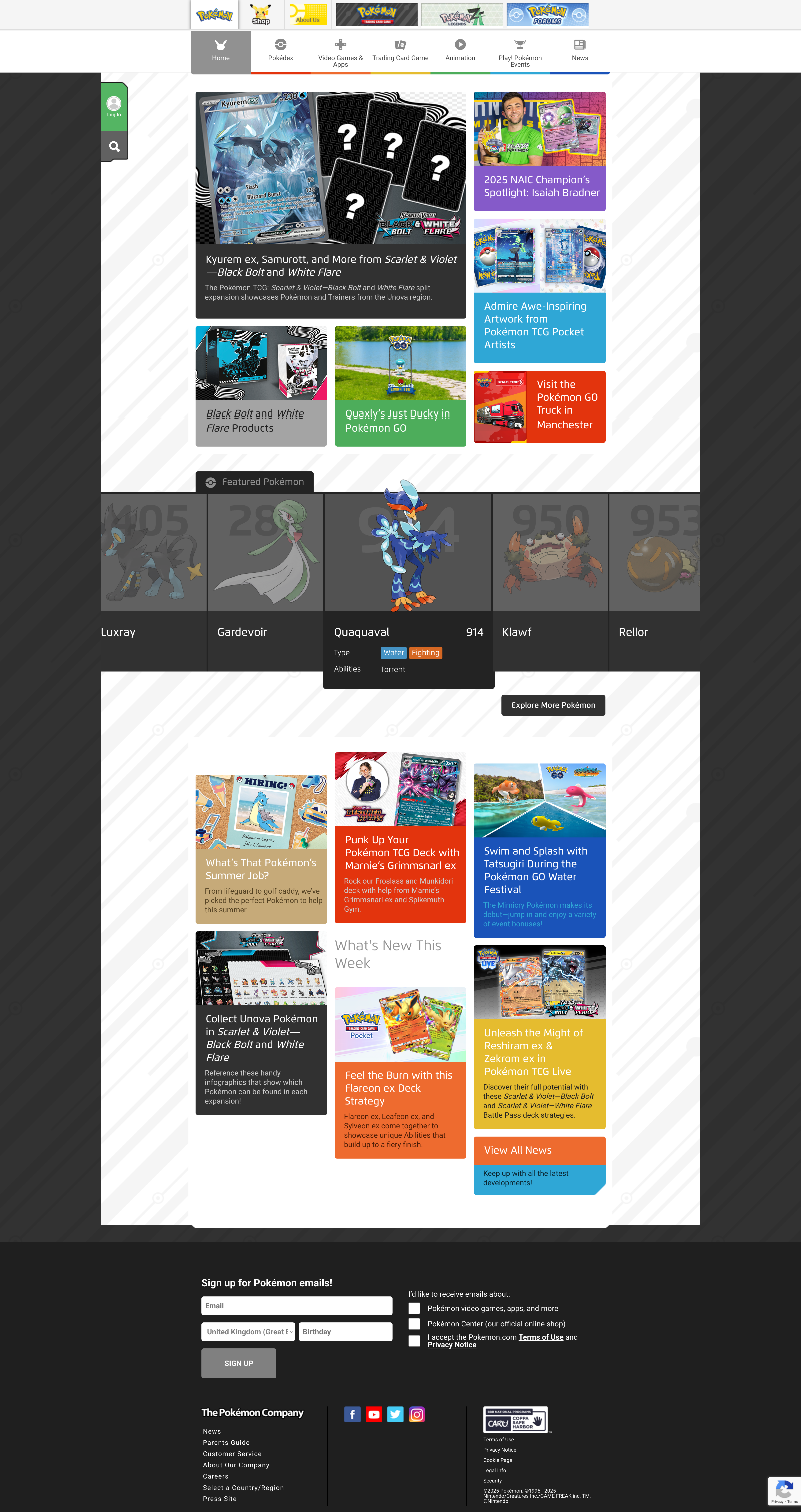
As of today, this is what the homepage of the official Pokémon website looks like (from top to bottom).
Navbar
This is the main navbar for the website that also has a static row of additional options sitting above.
Once the user scrolls, the top row of options will become hidden, and the navbar itself will collapse resulting in the icons becoming hidden too.

News
This is the news section that showcases the latest x5/x6 news items from the world of Pokémon.

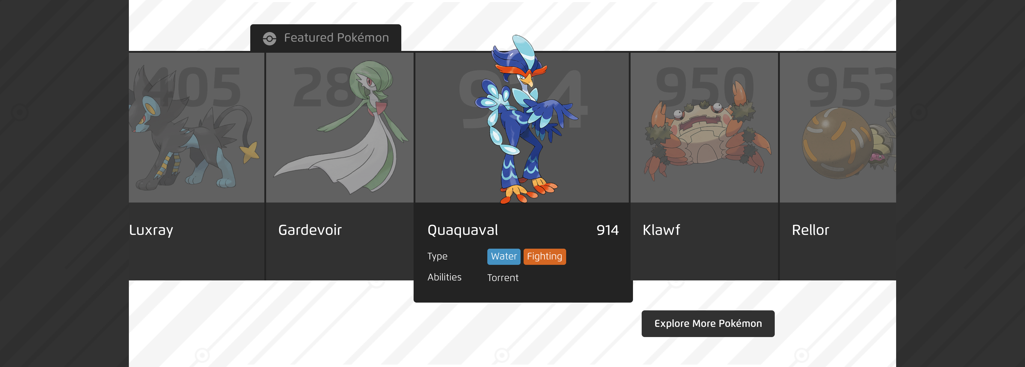
Featured Pokémon
This is the featured Pokémon section that showcases x10 randomly selected Pokémon.
Users can navigate left and right to see these featured Pokémon, and the cards are accessible and if interacted with (clicked/tapped), it will take you to the dedicated Pokémon page (there is also a button underneath that will take you to the full Pokédex page - button is 'Explore More Pokémon').
There is also a button underneath that will take you to the full Pokédex page, the button is 'Explore More Pokémon'.
What's New This Week
Similar to the news section at the top of the page, this is an additional news section that showcases the next x5/x6 news articles from the world of Pokémon.
There is a button in the form of a smaller card, 'View All News', that when interacted with will take users to the full dedicated news page on the Pokémon website.
Footer
This is the footer on the Pokémon website. It contains additional links, social media links, and further supporting links that are typically found on most websites. There is also an additional input field to allow users to sign up for Pokémon emails to keep up to date with the latest news from Pokémon.
Final Designs
The following designs are the final concepts for the Pokémon website redesign. The design offers users the same features as the live version, but within a completely redesigned interface.
Navbar
The new navbar has hidden the icons from the very beginning, and now offers a more simplified approach. When users are to hover over one of the navbar options, it will still use the core theme of the different colours, but instead of highlighting the entire text section, it now displays a subtle underline instead.
The new navbar also incorporates the 'Search' and 'Login' functionality that is seen fixed to the left side of the page on the existing website.
Another difference with the new navbar is that the static row of options seen in the existing version has been removed and used further down on the homepage.

Main Header
To truly make use of the screen space available, the initial news section seen in the existing version has been replaced with the latests news piece from the world of Pokémon in the form of a banner header.
This style allows for an instant call to action to all users. The banner itself can be customised to take users to the main news article or to a different website as seen in this example (the news item used in this example was from the recent announcement from Pokémon GO).

Main Header - Alternative
The use of a banner header can be versatile as you can also use videos instead of static images. With the use of videos, you are able to offer a more interactive way to capture the users attention from the very beginning.
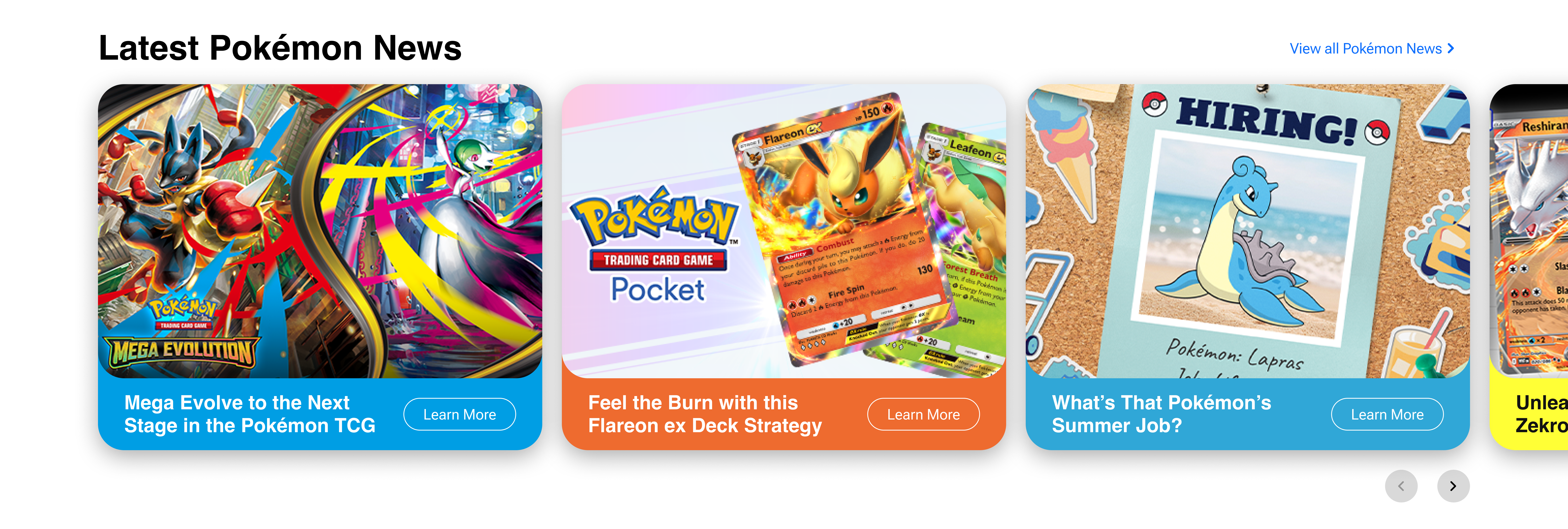
News
The news section has been redesigned in the form of a clickable/scrollable carousel that showcases the latest news from Pokémon (x7 news items).
Users can still navigate to the main news section using the 'View all Pokémon News' button that sits above the carousel itself, and users can still navigate through to a specific news article by using the 'Learn More' button on each card (the cards can also be interacted with).
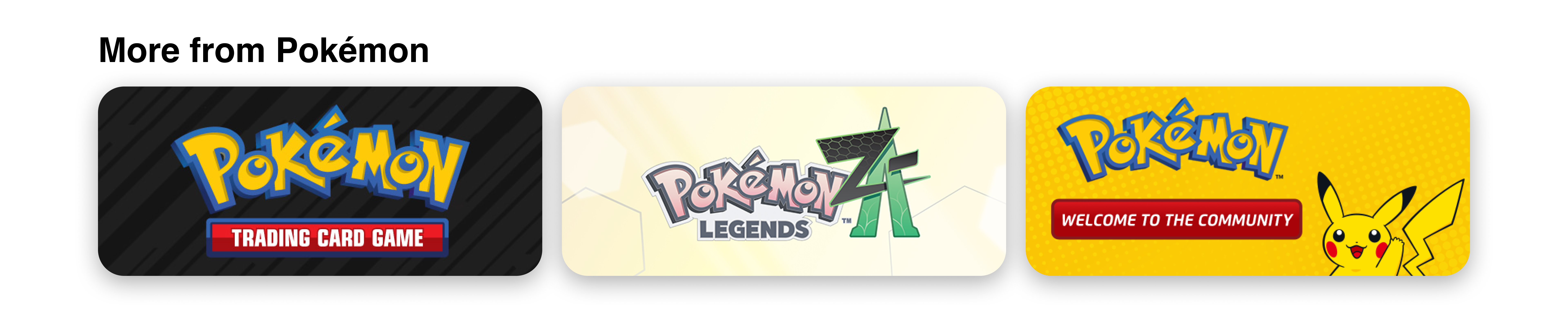
More from Pokémon
The 'More from Pokémon' section has been created and brought to the forefront as these are featured in the static row of options above the navbar in the existing version of the Pokémon website.
I found that these were key pieces of content that are being lost within the current website, so therefore I wanted to give them more of an opportunity to be seen.
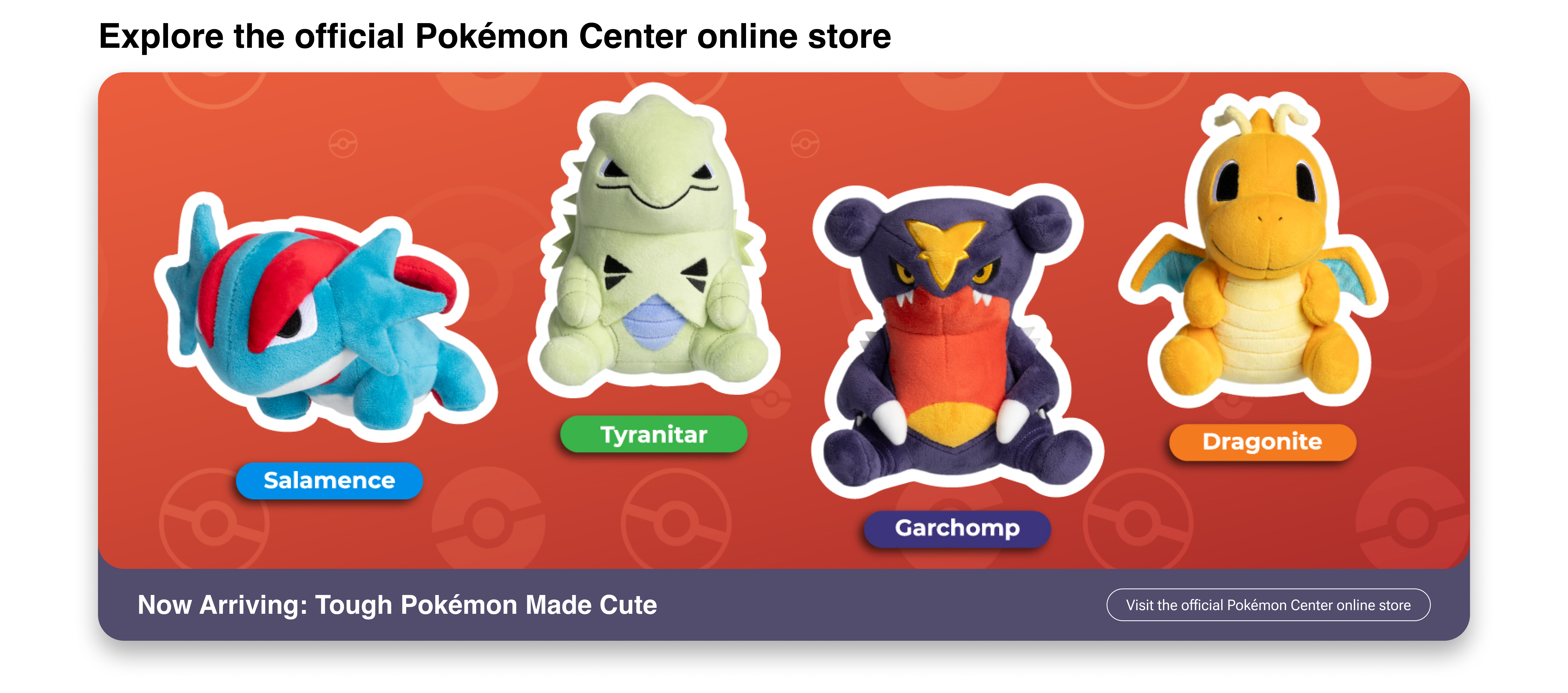
Pokémon Center online store
Similar to the section above, the Pokémon Center is part of the static row of options that can be missed if you don't know where to look on the existing website.
This section uses the same design as the banner card used for the main header, but this can also be adapted to showcase more than one piece of content from the Pokémon Center (for example you could use a x2 grid to showcase more products from the Pokémon Center).
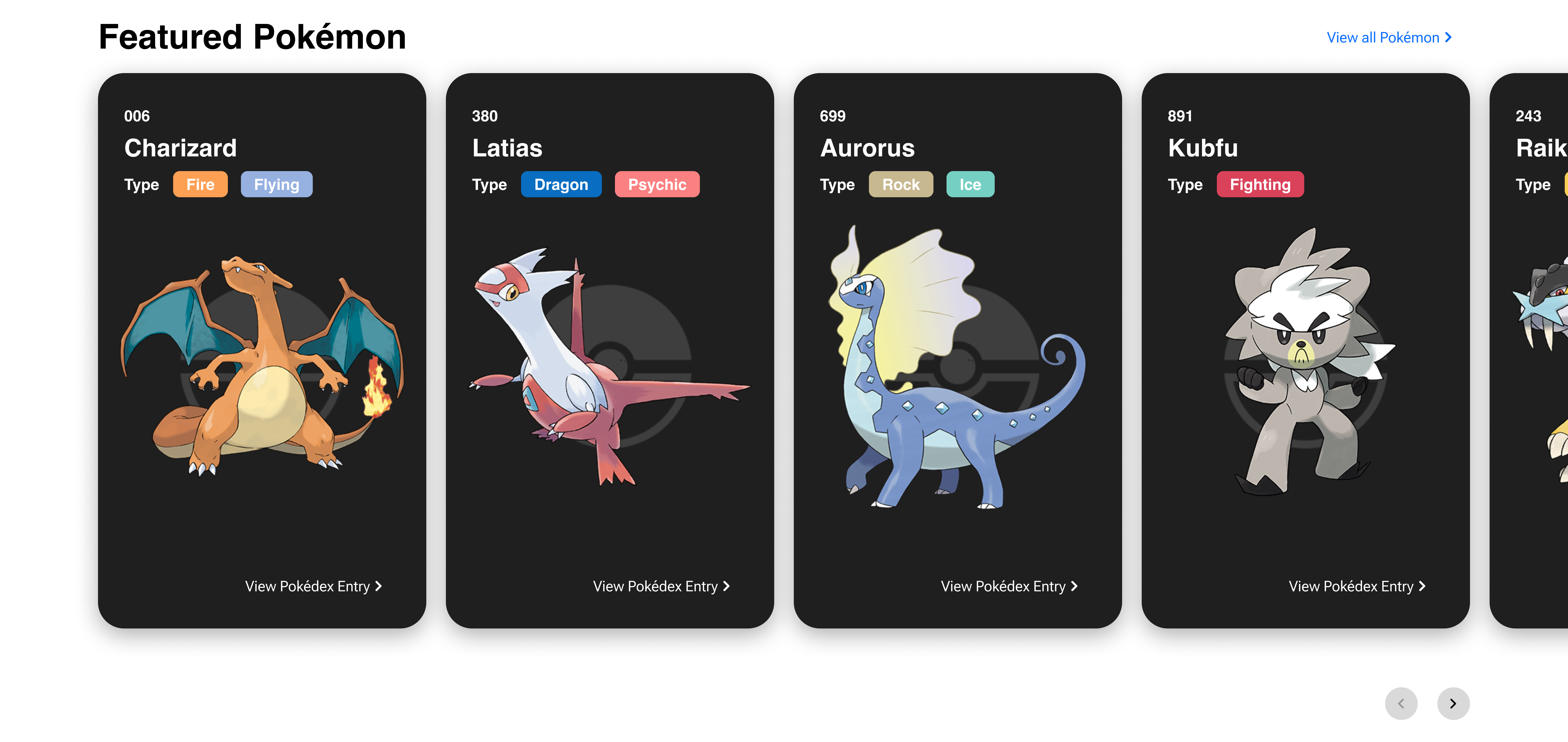
Featured Pokémon
This section uses a similar style used on the existing Pokémon website, but the design and functionality adopts the same as the 'News' section seen above in the website.
Users can still see the same content used on the original design, however the overall layout has been changed. The 'Explore More Pokémon' button used on the original design has been moved from the bottom of the carousel and now sits above the carousel on new version, and the button itself has been updated to 'View all Pokémon' (both would take users to the main Pokédex section on the website).
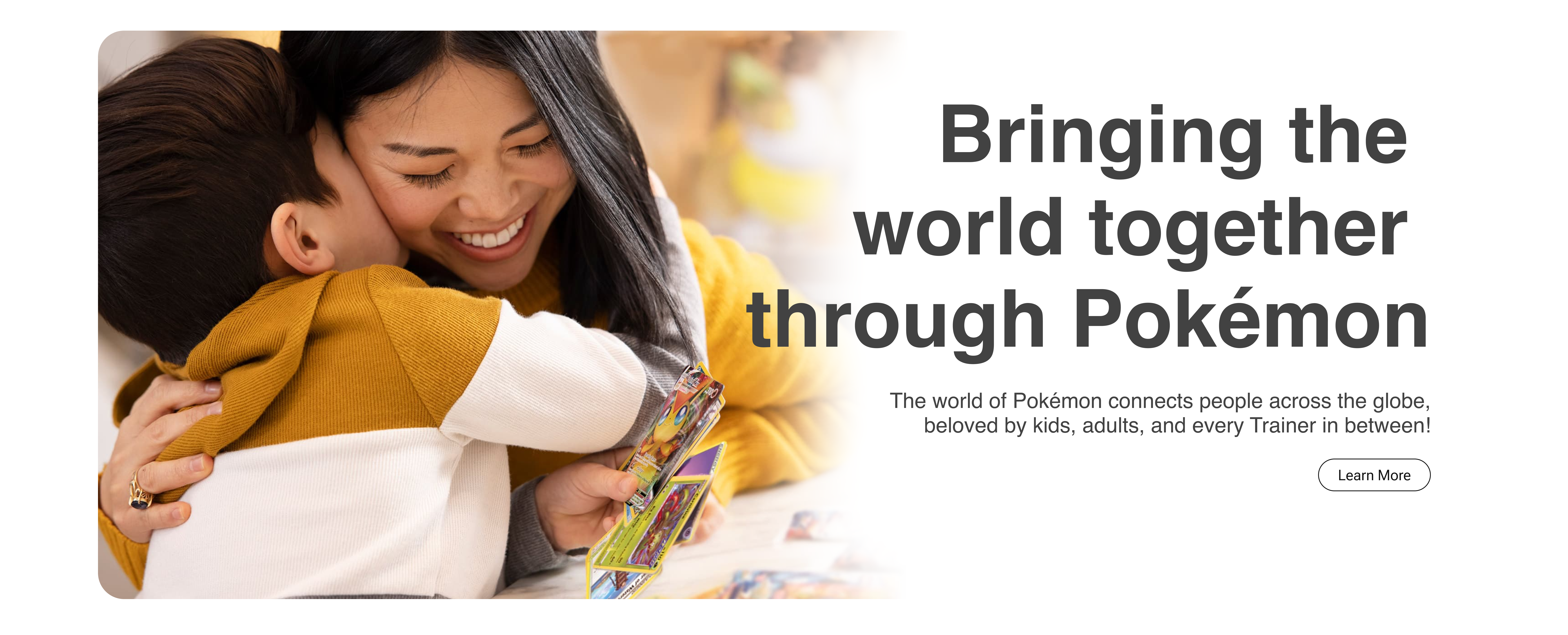
About Pokémon
The 'About Pokémon' section has been brought to the forefront, similar to the 'More from Pokémon' and 'Pokémon Center' sections, as this was also lost in the static row of options above the navbar on the existing website.
The story and journey of Pokémon is incredible, and it does truly bring anyone and everyone together and therefore, this section needs to be seen and spoken about more (this is why it has been given a highlighted section on the homepage within the new design).
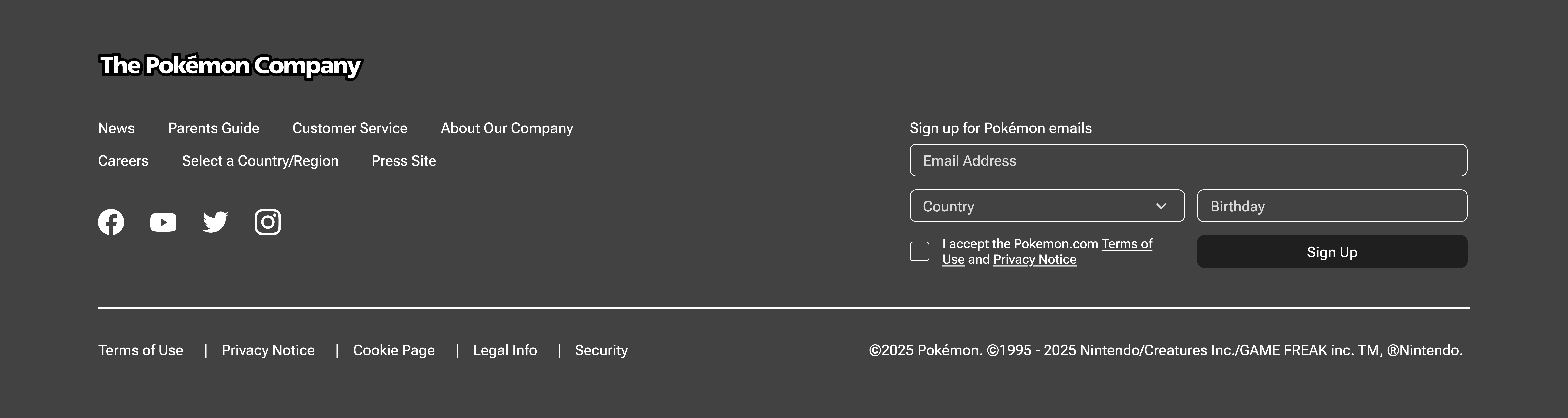
Footer
To close out the redesign, the footer has been adjusted to make more use of the space available and to have the flow of content be more accessible (all of the content has been categorised together).
Video Walkthrough
What's better than looking at static images? A quick video walkthrough!